ShopDreamUp AI ArtDreamUp
Deviation Actions


Suggested Deviants


Suggested Collections


![Bird footprints [F2U]](https://images-wixmp-ed30a86b8c4ca887773594c2.wixmp.com/f/23aeb8a2-0eff-4638-8d93-2ad3f29d0917/dau4cfz-eb0c305a-295d-4f68-9b5a-84af9dfdb305.png/v1/crop/w_158,h_38,x_30,y_0,scl_1/bird_footprints__f2u__by_cantshutup_dau4cfz-92s-2x.png?token=eyJ0eXAiOiJKV1QiLCJhbGciOiJIUzI1NiJ9.eyJzdWIiOiJ1cm46YXBwOjdlMGQxODg5ODIyNjQzNzNhNWYwZDQxNWVhMGQyNmUwIiwiaXNzIjoidXJuOmFwcDo3ZTBkMTg4OTgyMjY0MzczYTVmMGQ0MTVlYTBkMjZlMCIsIm9iaiI6W1t7ImhlaWdodCI6Ijw9MzgiLCJwYXRoIjoiXC9mXC8yM2FlYjhhMi0wZWZmLTQ2MzgtOGQ5My0yYWQzZjI5ZDA5MTdcL2RhdTRjZnotZWIwYzMwNWEtMjk1ZC00ZjY4LTliNWEtODRhZjlkZmRiMzA1LnBuZyIsIndpZHRoIjoiPD0xNTgifV1dLCJhdWQiOlsidXJuOnNlcnZpY2U6aW1hZ2Uub3BlcmF0aW9ucyJdfQ.vS-4k_GE-Ll8AAsNEvA5HAcsTOY6LlCs7-hzVRn3sRs)
![Bird footprints [F2U]](https://images-wixmp-ed30a86b8c4ca887773594c2.wixmp.com/f/23aeb8a2-0eff-4638-8d93-2ad3f29d0917/dau4cfz-eb0c305a-295d-4f68-9b5a-84af9dfdb305.png/v1/crop/w_92,h_38,x_30,y_0,scl_1/bird_footprints__f2u__by_cantshutup_dau4cfz-92s.png?token=eyJ0eXAiOiJKV1QiLCJhbGciOiJIUzI1NiJ9.eyJzdWIiOiJ1cm46YXBwOjdlMGQxODg5ODIyNjQzNzNhNWYwZDQxNWVhMGQyNmUwIiwiaXNzIjoidXJuOmFwcDo3ZTBkMTg4OTgyMjY0MzczYTVmMGQ0MTVlYTBkMjZlMCIsIm9iaiI6W1t7ImhlaWdodCI6Ijw9MzgiLCJwYXRoIjoiXC9mXC8yM2FlYjhhMi0wZWZmLTQ2MzgtOGQ5My0yYWQzZjI5ZDA5MTdcL2RhdTRjZnotZWIwYzMwNWEtMjk1ZC00ZjY4LTliNWEtODRhZjlkZmRiMzA1LnBuZyIsIndpZHRoIjoiPD0xNTgifV1dLCJhdWQiOlsidXJuOnNlcnZpY2U6aW1hZ2Uub3BlcmF0aW9ucyJdfQ.vS-4k_GE-Ll8AAsNEvA5HAcsTOY6LlCs7-hzVRn3sRs)


You Might Like…


![my limbs will become trees [COM]](https://images-wixmp-ed30a86b8c4ca887773594c2.wixmp.com/f/0cca024b-a1f2-4f7e-a8c3-b41e784c374d/da1t1qq-f30e9850-5480-4028-ac2a-45bcefacf21b.png/v1/fill/w_50,h_50/my_limbs_will_become_trees__com__by_saiiorrr_da1t1qq-fullview.png?token=eyJ0eXAiOiJKV1QiLCJhbGciOiJIUzI1NiJ9.eyJzdWIiOiJ1cm46YXBwOjdlMGQxODg5ODIyNjQzNzNhNWYwZDQxNWVhMGQyNmUwIiwiaXNzIjoidXJuOmFwcDo3ZTBkMTg4OTgyMjY0MzczYTVmMGQ0MTVlYTBkMjZlMCIsIm9iaiI6W1t7ImhlaWdodCI6Ijw9NTAiLCJwYXRoIjoiXC9mXC8wY2NhMDI0Yi1hMWYyLTRmN2UtYThjMy1iNDFlNzg0YzM3NGRcL2RhMXQxcXEtZjMwZTk4NTAtNTQ4MC00MDI4LWFjMmEtNDViY2VmYWNmMjFiLnBuZyIsIndpZHRoIjoiPD01MCJ9XV0sImF1ZCI6WyJ1cm46c2VydmljZTppbWFnZS5vcGVyYXRpb25zIl19.bLPJ6zOk49bpY1J39Wqwq50lph4_CVSe-kVGBbcemWo)
![Kieran Icon | [Commission]](https://images-wixmp-ed30a86b8c4ca887773594c2.wixmp.com/f/d58bf912-e73f-46a1-810a-0f25e3f58884/dcndl16-6275a8b4-f8ed-4849-bdbb-d049a63a62f9.gif?token=eyJ0eXAiOiJKV1QiLCJhbGciOiJIUzI1NiJ9.eyJzdWIiOiJ1cm46YXBwOjdlMGQxODg5ODIyNjQzNzNhNWYwZDQxNWVhMGQyNmUwIiwiaXNzIjoidXJuOmFwcDo3ZTBkMTg4OTgyMjY0MzczYTVmMGQ0MTVlYTBkMjZlMCIsIm9iaiI6W1t7InBhdGgiOiJcL2ZcL2Q1OGJmOTEyLWU3M2YtNDZhMS04MTBhLTBmMjVlM2Y1ODg4NFwvZGNuZGwxNi02Mjc1YThiNC1mOGVkLTQ4NDktYmRiYi1kMDQ5YTYzYTYyZjkuZ2lmIn1dXSwiYXVkIjpbInVybjpzZXJ2aWNlOmZpbGUuZG93bmxvYWQiXX0.iTTeLTY8uTNEZMDliUrjc01dWEqKGFs-Ffb1td0LL3Y)
Featured in Groups


Description
The first one was of Fallblossom, the second one of Good ol' Wacko Paddlegrooven
This one is both of them together for the return.
 (October 1st, 2013)
 (Febuary 23, 2014)
Heres this one, July 15th, 2014
I'll probably remake this 4 months later haha XD
I'm also tagging @Pierulez100 who gave me suggestions on my previous uploads
Hope you guys like it please ***comment*** and fav!!
This one is both of them together for the return.
(October 1st, 2013)(Febuary 23, 2014)Heres this one, July 15th, 2014
I'll probably remake this 4 months later haha XD
I'm also tagging @Pierulez100 who gave me suggestions on my previous uploads
Hope you guys like it please ***comment*** and fav!!
Image size
500x500px 260.26 KB
© 2014 - 2024 Official-Fallblossom
Comments1
Join the community to add your comment. Already a deviant? Log In
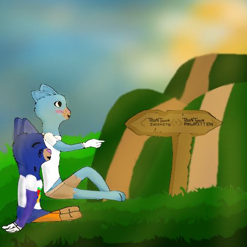
First off, the lineart looks stable, and the background is simple enough to be able to grasp what it is without much detail. However, some of the colors smudge the black lines of the cats, so the lineart is a bit blurry in some areas. Ex. right side of Blue cat's ears. The grass looks well drawn, but the sun looks a bit smudged with the blue sky, making a sort've greenish unclean tinge on the edges. The dimensions of the sign seem okay as well.
The two toons however, look a bit crooked and some of the joints are bending awkwardly. As an avid Toontown player, I'm going to point out that the snout on the pale cat looks a bit too sloped and the nose should be lower, not on the bridge of her snout. The darker blue cat seems to look fine though with his nose. The ears on the blue cat seem oddly placed, as if both of them are behind his head. The right ear could be lowered to the left a bit to show the shape of his head. Same with the pale cat. There is also a lack of some shading. Remember the source of light is the sun, so there should be a bit of darker shading/depth behind them if they're facing it. The colors look fine as it is. The dark blue cat's hands look a bit angled awkwardly and the feet seem to be a bit disproportionate or too stubby. But knowing Toontown's leg customization, this might be part of his design. Another thing to point out is that the pale cat's right leg is a bit floating above the grass, and her left foot's ankle disappears behind the other leg.
The whiskers/fur on the dark blue cat's cheeks are a bit stiff and could be a little more flowing or curved.
But the symbolism in it is well-said, as there are multiple toontown servers now. *sniffles* I'm becoming too nostalgic now!
Originality-wise, I've seen quite a bit of Toontown pieces with similiar drawings and themes of their toons moving to the new server. But regardless, I always get a little choked up whenever I see a toontown picture like this, as it's showing that Toontown still lives on. I also love the fact that the sun is on the horizon. Just gives it a good feeling in my chest.
In overall, this is a great improvement from your previous pieces, and I'm sure you'll only keep getting better.